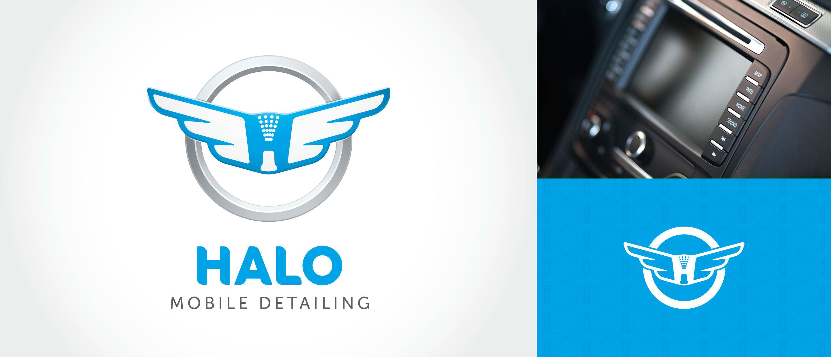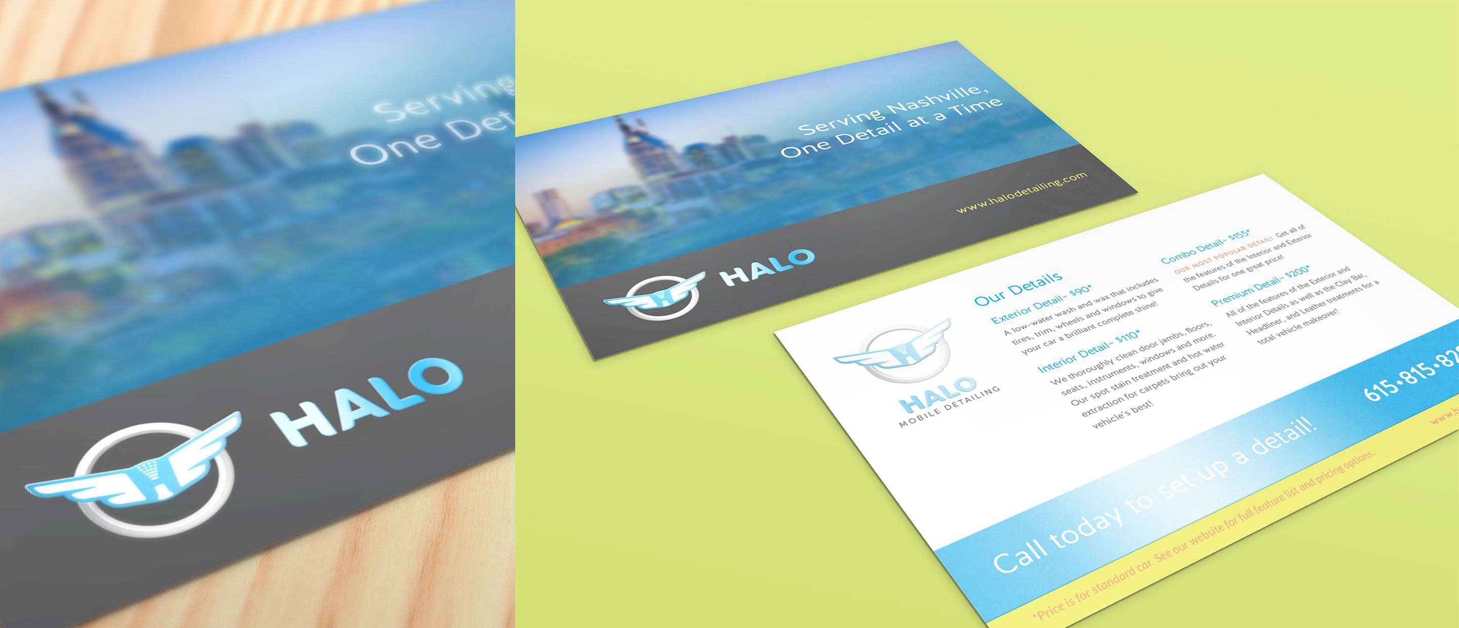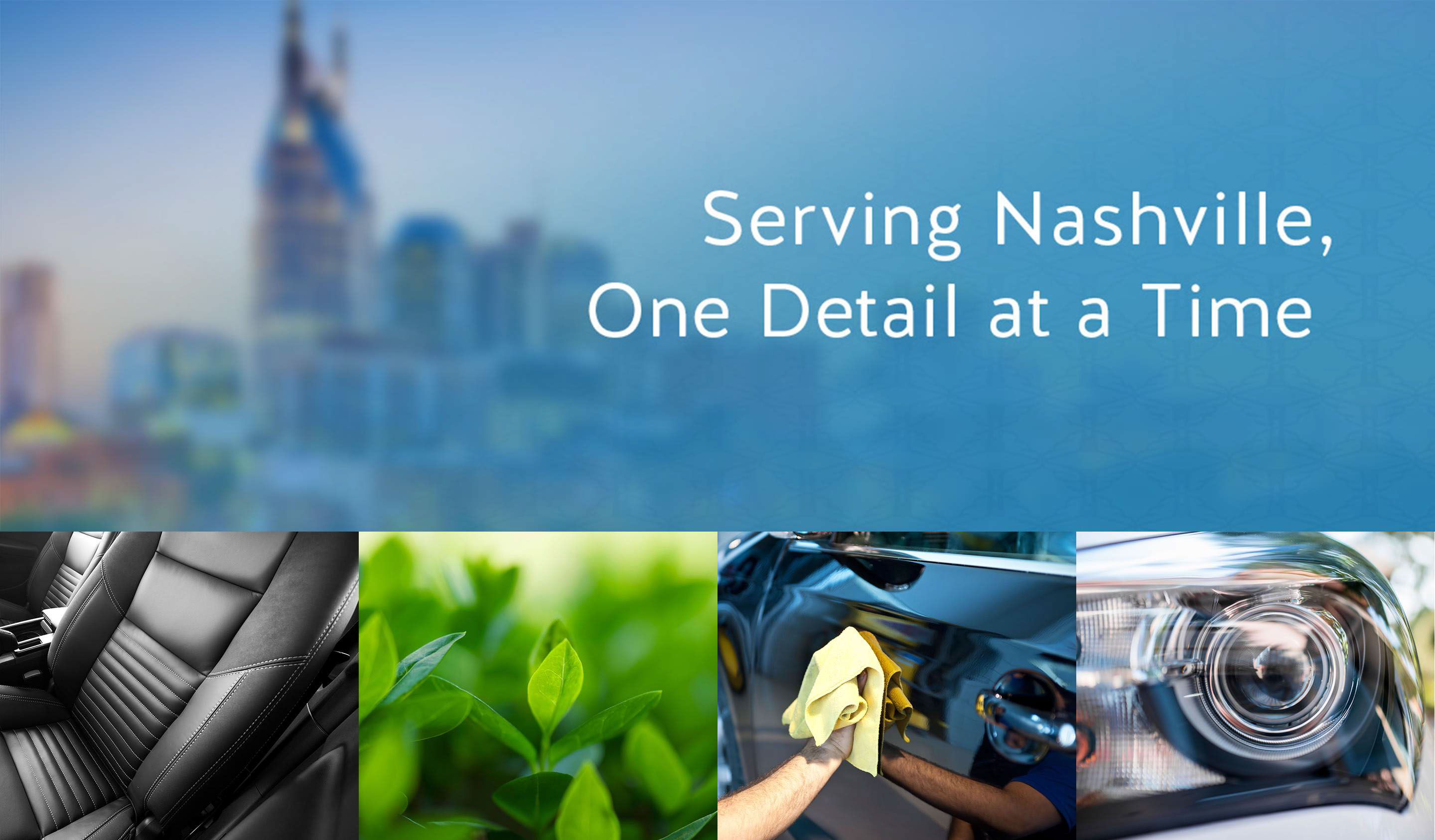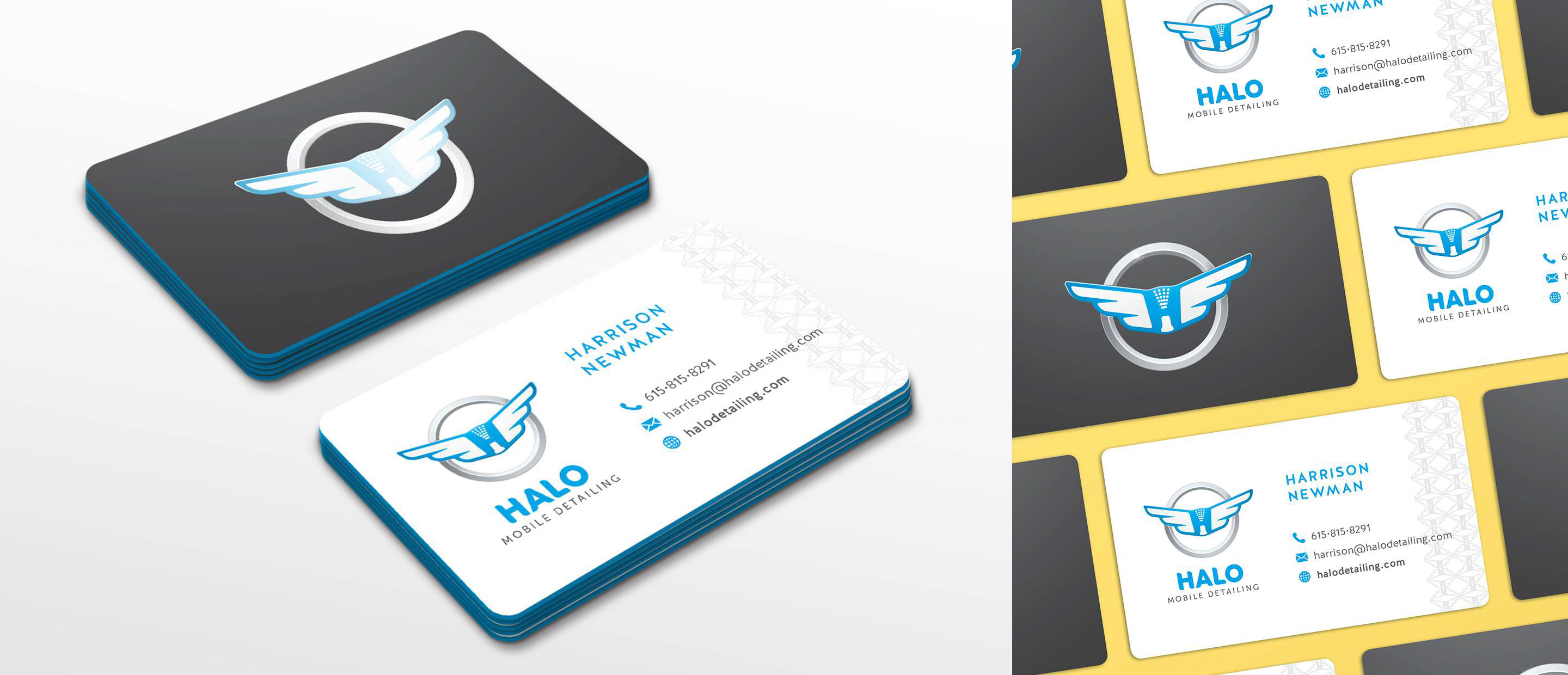
Halo Mobile Detailing Branding
Halo wanted to establish a full brand and online presence for the company as it launched. The company, a 'waterless' mobile detailing company, wanted a brand that communicates clean, professional, and eco-friendly. Ties to the auto industry were desired, but not if it meant being too masculine. After research into the detailing market and the competition, we decided to pursue a look similar to what you might see from an auto manufacturer. The icon incorporates the silver ring as a halo, the wings that not only again point to the name but are also common in the car industry, and an uppercase H that is formed by a subtle spray nozzle in the negative space. We created custom type, using rounded edges on the logo font as well as the business cards. With a fresh, clean color palette, copy writing, and carefully selected imagery, we met the project goals and created a brand that is professional, clean, and modern. Silk laminated business cards and spot UV gloss on the printed pieces add a special touch and communicate the attention to detail that Halo practices. Items delivered: Logo, Color Palette, Brand Standards, Business Cards, Postcard Flyer, Website, Social Media Styling Services Provided: Art Direction, Design, Branding, Marketing, Copywriting